
The terrifying map you don't want your town to be on
In an Australian first, cutting-edge technology is being used to identify cancer “clusters” on an interactive map.
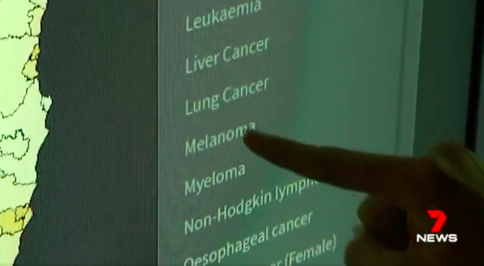
It’s a map you might want your town left off, but the Australian Cancer Atlas will allow you to search your suburb to identify the diseases most prevalent in your area.
The atlas documents clusters in detail for the first time in the world, compiling every diagnosis and death in the past five years for the 20 most common forms of cancer.

“Unless we have that information, we don’t know where to direct resources, so now we do,” Cancer Council Queensland’s Joanne Aitken said.
The map indicates that the highest incidence of breast cancer is in southeast Queensland. The incidence is 18 per cent in St Lucia, 16 per cent in Bulimba and 16 per cent in Hamilton.
But those living in those areas are also most likely to survive.
‘I checked it that many times’: $30m Powerball mystery solved
Extraordinary footage of tourist jumping on top of 650kg crocodile
If diagnosed with prostate cancer, your survival rate is among the worst in the state if you live on the Sunshine Coast or Gold Coast.
If you live in or near Caboolture, you are 40 per cent more likely to be diagnosed with lung cancer.
Melanoma rates are high in Brisbane’s Bayside, while the worst cancer rates are in the state’s far north.
You’re 261 per cent more likely to get liver cancer if you live in the Torres Strait Islands.
While Australia is mapping out its cancer clusters, the model could be exported internationally, with developers already in talks with New Zealand’s health department.

