'Doesn't make sense': Confusion as well-known Aussie logo is changed
A newly signed-off Australian logo has raised eyebrows for its peculiar resemblance to a coronavirus particle and the existing imagery used by the National Broadband Network.
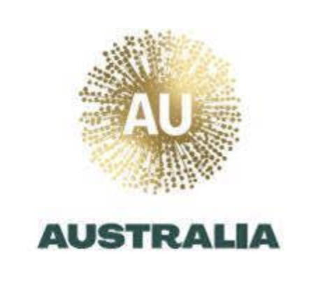
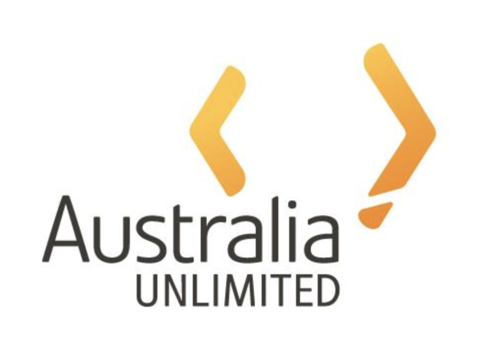
The new design of a gold wattle with the letters “AU” in its centre will replace the previous Australia Unlimited logo where two orange boomerangs were positioned to represent the shape of the country.
The Nation Brand Advisory Council claims the $10 million revamped image – revealed Tuesday evening after being approved by trade minister Simon Birmingham – will “bring some consistency” to Australian business, industry and government agencies on the international stage.
Not everyone is impressed by the design however, with the public largely expressing confusion and experts agreeing that the logo may be set to do more harm than good when it came to Australia’s reputation.

“The logo they’re going with, apart from looking like a coronavirus, it’s supposed to be a wattle, and they’re using it for international missions and trade shows, but a lot of international people wouldn’t know what a wattle was,” Dr David Waller, Associate Head of Marketing at the University of Technology Sydney, told Yahoo News Australia.
“Having a gold explosion on top of the letters AU, which is also the mineral symbol for gold, it doesn’t represent Australia.”
Popular Woolworths item to be made in Australia instead of China
Tourists warned after new video exposes cruel elephant training methods
Dr Waller said he was surprised at the replacement of the boomerang logo, as the previous symbol was easily recognisable to an international audience.
“Somebody from overseas looking at that [the new logo], would have absolutely no idea what it meant. People from overseas could at least have a bit of an idea with the two boomerangs.”
He added that “it doesn’t make sense” for the government to be spending $10 million in the current climate, given the position of the budget and ongoing coronavirus crisis.
The council however – comprised of figures including mining magnate Andrew Forrest, Qantas boss Alan Joyce, Atlassian co-founder Mike Cannon-Brookes and Coopers Brewery chairman Glenn Cooper – says the logo aptly represents the country and its “cultural richness”.
“Our proposed nation brand mark balances a literal and abstract interpretation of a wattle flower. It’s an optimistic burst of gold positivity,” the council wrote in its report to Mr Birmingham last year.
“Co-created with our Indigenous design partners Balarinji, the mark is embedded with a cultural richness and graphic voice that speaks distinctively of Australia.
“The hearty resilience of the wattle has come to represent the enduring spirit of the Australian people. This small, beautiful flower is an organic burst of positivity – in bright joyous gold.
“It speaks of warmth, expanding ideas and horizons, with the pollen-laden stamens radiating a sense of energy and dynamism. It is an authentic national symbol that is elegantly and undoubtedly Australian.”

While this may all be true, the council might be hard pressed finding people locally and internationally who could recognise the logo as Australian, Professor Gary Mortimer, an expert in marketing at the Queensland University of Technology business school said.
“I think the reasonable consumer would look at it and genuinely confuse that possibly with the NBN logo,” Professor Mortimer told Yahoo News Australia.
“It would be completely subjective how a reasonable consumer might interpret that image. Some might see it as a wattle, some might see it as a virus, others might see it as a different logo.”

Prof Mortimer said perhaps the most obvious issue was that the symbol didn’t connect with what most people would consider to be Australian.
“I can see its reference to a wattle only after I was informed its supposedly a wattle. Without that information I would struggle connect it to a wattle.
“I think international markets would struggle to find the connection.”
New logo ‘won’t replace the kangaroo’
Despite some media reports suggesting the new logo would replace the Australian Made symbol, it was confirmed to Yahoo News Australia the yellow kangaroo inside a green triangle would remain.
Mr Birmingham revealed on Wednesday the government was spending $5 million on the existing logo to make sure “it is better used [and] better recognised”.
He told radio program 5AA that the new logo was a “stylistic, modern representation of Australia” and resembled a point of difference to other iconic Australian brands using kangaroos like Qantas, the Wallabies and Tourism Australia.
Mr Birmingham dismissed the logo’s resemblance to a coronavirus, instead insisting the symbol was designed to stand the test of time and become more recognisable as time went on.
Do you have a story tip? Email: newsroomau@yahoonews.com.
You can also follow us on Facebook, Instagram and Twitter and download the Yahoo News app from the App Store or Google Play.


